Monday, 21 June 2010

jonathan capecchi


It's always good to hear from people who look at your stuff;
Introducing jonathan capecchi a recent graduate of Cardonald College.

Among his projects, I found this striking booklet, full of repeat patterns, stark vector images and well executed type layout.

Good work sir

Neon Signs

Everyone loves a neon sign. Sate your sign lust by clicking here

Saturday, 24 April 2010

Hipstamatic


If you're lucky enough to own an iPhone and this style of photography appeals then your next App download will be Hipstamatic. For a mere £1.5omething you can swap between lenses, coloured flashes and film grade with the option to buy more accessories as you go.

It almost make you feel sorry for Lomo. Well, they shouldn't charge so much for plastic cameras should they...

Tuesday, 6 April 2010

Robert Mars


To see a more extensive collection of vintage car badges like this click HERE

But right now, wipe me dry.

Thursday, 1 April 2010

Update on Graphical House talk

Update**

Due to overwhelming demand we’ve had to change the venue for our Graphical House talk to The Glasgow School of Art.

If you’ve reserved a place and now can’t make it please let us know.

If you not reserved a place, spaces are extremely limited so please be quick.

Tuesday, 30 March 2010

Matt Mignanelli ++ Recoat ++ This Friday

Opening this Friday 2nd April, Paradigm, a solo exhibition by NY based Matt Mignanelli.

Silent Sea: Reprieved

Silent Sea: Reprieved. from Callum Rice on Vimeo.


I feel slightly humble...

Pretty Rough


just to let you know about the blog that Andrew, Daniel & Jennifer from the 2nd year here at the Met set up to showcase their work.


Monday, 29 March 2010

Long Lunch ++ Event 35 ++ Graphical House


Welcome back. Just spotted that the ever industrious Long Lunch are involved in the forth coming talk on the 15th April at the Apple Store by Glasgow outfit Graphical House. Tickets are free but I'm guessing they'll go quick - you can book up through the link below.

Monday, 22 March 2010

A Rush of Blood

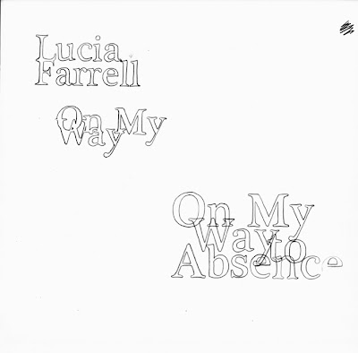
The following 4 posts are examples of work generated after I challenged some 2nd Year students to working on a CD artwork brief with them.

I'd like to point out that after I set the challenge, I realised I only had a single day not teaching to produce anything - I did my best not to let this hold me back though.

The aim at this stage was not to produce finished artwork but 'roughs' and experiments to establish a style.

1. Lino (yes, really)


I usually get a rather blank look if I ever suggest lino-cuts as a credible medium for generating text or artwork.

I'm on a one-man mission to change that.

2.Skittles


I was interested in creating faded rainbow like patterns after reading the brief
(I was thinking about American Indie movies after reading the Farrel album info) so I soaked some printing paper and layed some Skittles on top to see what the effect would be.

I think the result might look good paired up with the outlined text below...


3.


4.